WEBSITE REDESIGN · UX · CONTENT STRATEGY
Hilton Woodland Hills
Digital Refresh
A conversion audit and redesign of Hilton Woodland Hills' homepage and Mitzvah landing page.

CONCEPT WORK An independent redesign exploring how the Hilton Woodland Hills digital experience could work harder for visitors.
TYPE
Self-initiated concept
ROLE
UX & Content Strategy
BRAND
Hilton Woodland Hills
DELIVERABLE
Homepage + Mitzvah page redesign
THE
STRATEGIC LENS
Two Pages, Two Very Different Jobs
I chose the homepage because it is the main entry point to the hotel — the first place a potential guest should be able to understand what makes the property worth considering. I chose the Mitzvah page because it serves a very specific audience with a much more focused conversion goal.
Looking at both meant looking at the broader hotel experience and at a page designed around a single event audience. The homepage has to make a case to someone still deciding whether to consider the property at all. The Mitzvah page has to answer a planner who has already decided they're interested and now needs to know whether it will work.
I worked at this property as Sales & Marketing Coordinator. That meant I already understood the types of guests and event clients we served, and the questions people needed answered before they would inquire or book. This audit started from that gap — between the property I knew and the website representing it.
WHAT I FOUND
INFORMATION ISN'T GUIDANCE
The website provided information, but it didn't do enough to guide users toward the information they actually needed to make a decision.
Both pages were populated. Neither was structured around a decision.
THE HOME PAGE
THE MITZVAH PAGE
THE HOME PAGE
ACROSS BOTH
The two pages didn't read as the same website.
Different navigation, different footer, different typographic treatment. A planner arriving on the Mitzvah page and clicking through to the hotel crossed a visible seam.
None of these are failures of effort. Both pages contain real information about a good property. They're failures of sequence — the right facts arriving in the wrong order, at the wrong size, too far from the moment someone needed them.
THE
STRATEGY
Turn Information Into Guidance
Not more content. The same content, sequenced around the decision each visitor came to make.
Lead with the claim, not the name.
Replace the hotel's own name in the hero with the reason to consider it.
Answer the question at the moment it's asked.
Surface the decisive facts — room types, square footage, capacity, catering, distances — as scannable elements where a visitor needs them, rather than as prose to be read through.
Give people something to act on, throughout.
A visible primary action in the hero, and again at each point where someone might be ready.
Show proof, not adjectives.
Photography of the actual property and real celebrations in place of stock and assertion.
CREATIVE DIRECTION
Inside the Brand, Above the Standard
Hilton's navy and gold are fixed points — a property can't redesign its way out of a global brand system. Everything else was open: type scale, spacing, photography, and the order things appear in.
Hilton Navy
#10203F
Gold Accent
#A6853F
Warm Cream
#F2EFE9
Charcoal Black
#14161A

KEY
IMPROVEMENTS
A claim, then the evidence for it
The hero states the reason to consider the property. Everything beneath it answers the next question in the order a visitor asks it: what the rooms are, what they cost, what's nearby, what other guests said.
CLEARER HIERARCHY
One idea per band, sized by how much it matters
STRONGER IMAGERY
The property and real celebrations, not stock
DECISION-READY INFORMATION
Rooms, rates, capacity and catering, stated as facts
VISIBLE CALLS TO ACTION
An ask in the hero and at every point of readiness
THE
BEFORE
Before the rethink
The existing Hilton Woodland Hills site had the information, but the experience made it difficult to understand what mattered most. Key details were competing for attention, the visual hierarchy was unclear, and the property’s personality wasn’t coming through.


THE
HOMEPAGE
A claim, then the evidence for it
The hero states the reason to consider the property. Everything beneath it answers the next question in the order a visitor asks it: what the rooms are, what they cost, what's nearby, what other guests said.
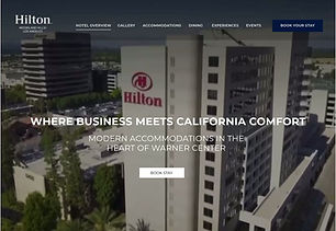
THE EXPERIENCE IN MOTION
REDESIGN The homepage in full — scroll within the frame. Concept design, never implemented.
THE
MITZVAH PAGE
Answer the planner's questions in order
A celebration in the hero instead of a dessert table, then the six things families ask about before they inquire — including outside and kosher catering and discounted room blocks, neither of which appeared on the original page.
REDESIGN The Mitzvah page in full — scroll within the frame. Testimonial copy shown in this redesign is written to demonstrate the layout. It does not represent real guest feedback.

WIREFRAME
SCOPE
Self-initiated concept project. Not commissioned by Hilton, not affiliated with Hilton Worldwide, and not work produced during my employment at the property. Testimonial copy shown in the redesigned Mitzvah page is written to demonstrate the layout — it does not represent real guest feedback. No results are claimed; the redesign was never implemented.


